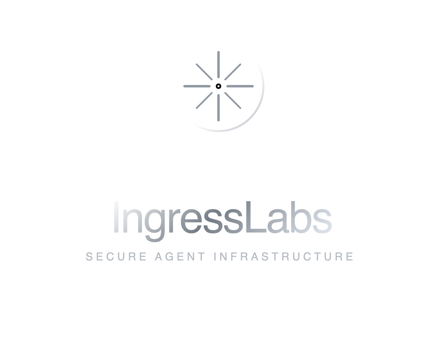
Primary lockup
Use on graphite, black, and dark metal surfaces.
A compact identity package built around the original radial ingress mark, graphite surfaces, and operator-grade restraint.
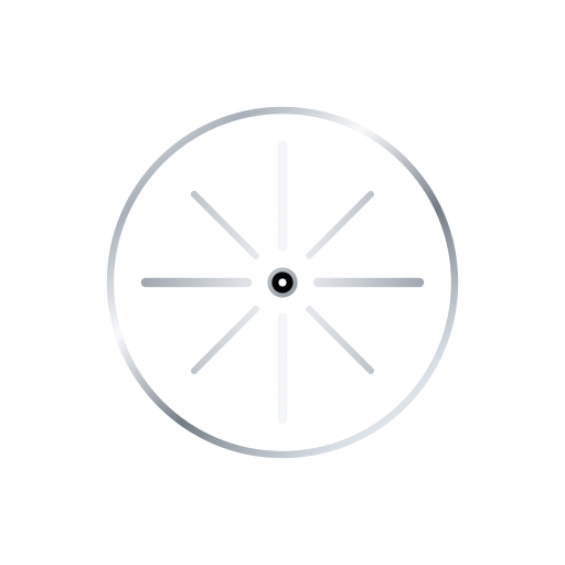
The mark keeps the supplied circular route geometry, then reduces it to graphite, silver hairlines, separated paths, and a small routing node so it feels technical rather than automotive.
Use on graphite, black, and dark metal surfaces.
Use where the brand already has context.

Use as the footer seal or as a small institutional badge when the full logo appears nearby.
Use for square compositions and centered brand moments.
Use only on white, paper, or light silver surfaces.
Use these when IngressLabs needs to feel like an infrastructure company in decks, social cards, technical documents, and product architecture pages.

Use for serious social, deck, and announcement placements.

Use as a wide product or architecture hero visual.

Use for enterprise deployment and regulated infrastructure conversations.

Use for technical briefs, PDF exports, and architecture documents.

Use as a restrained graphite background or document divider.
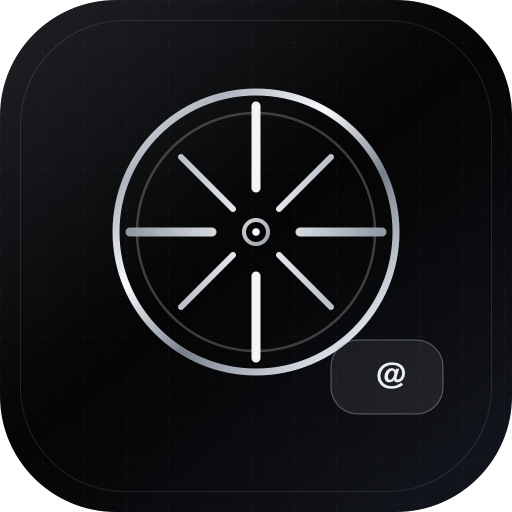
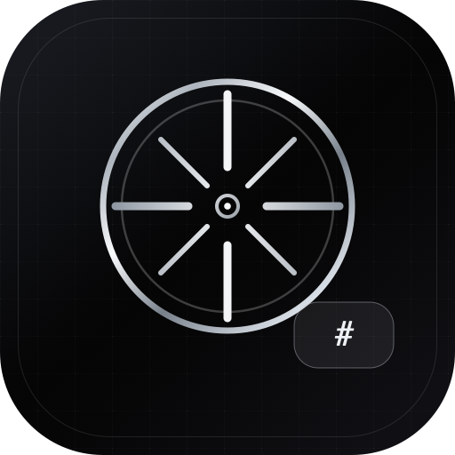
Square avatars and wide cards for Telegram, Slack, and Twitter channels, kept inside the graphite and silver brand system.
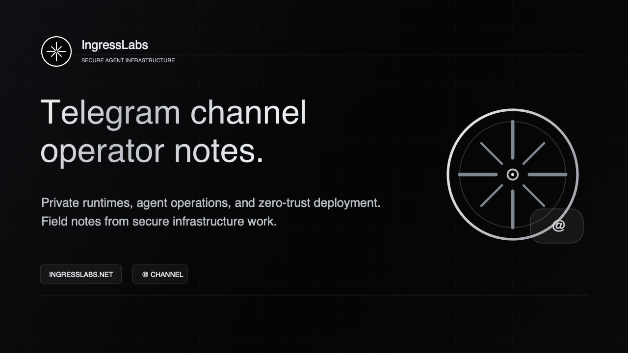
Use as the square channel image on Telegram.
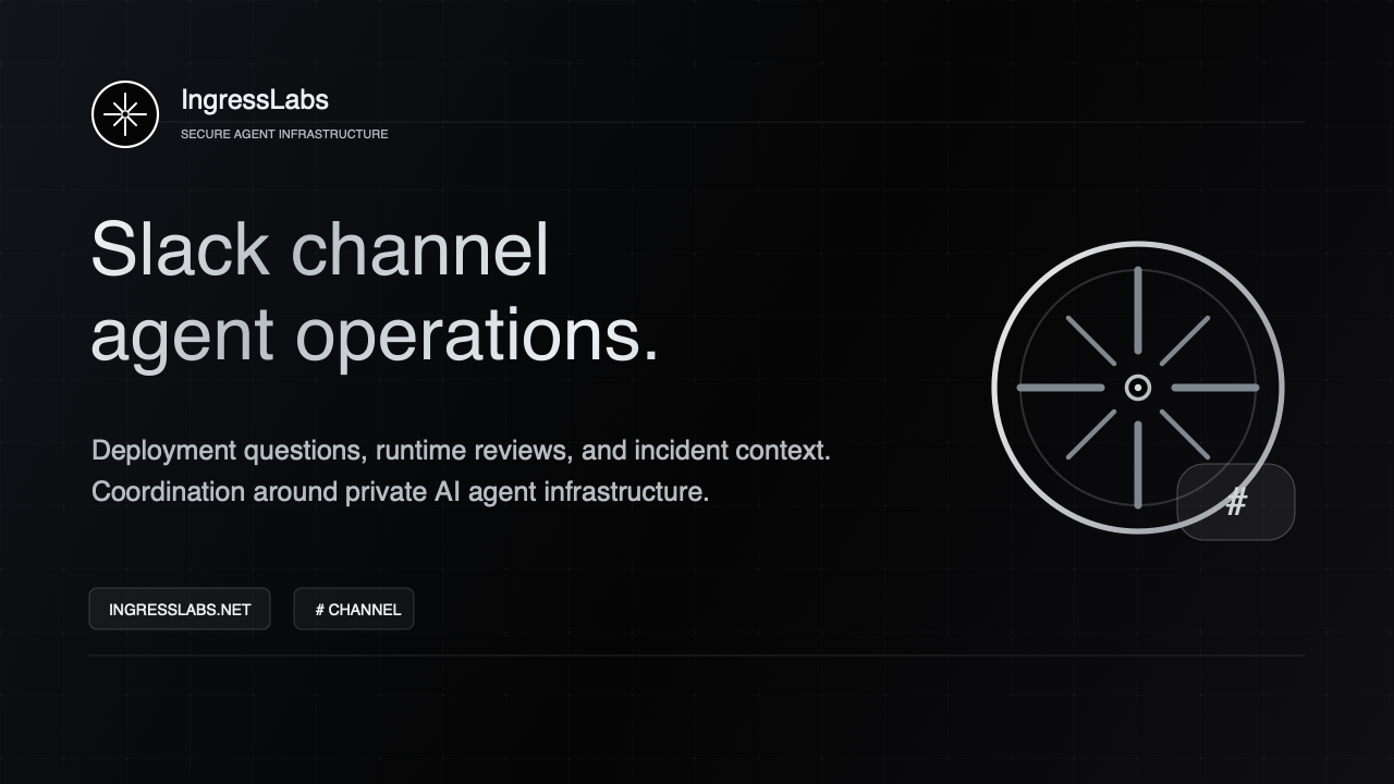
Use as the square image for Slack channel or workspace surfaces.
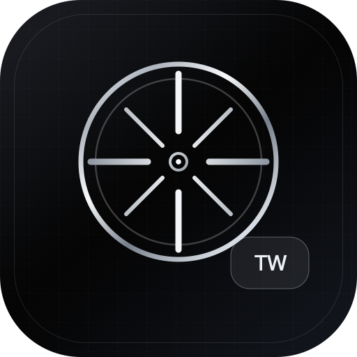
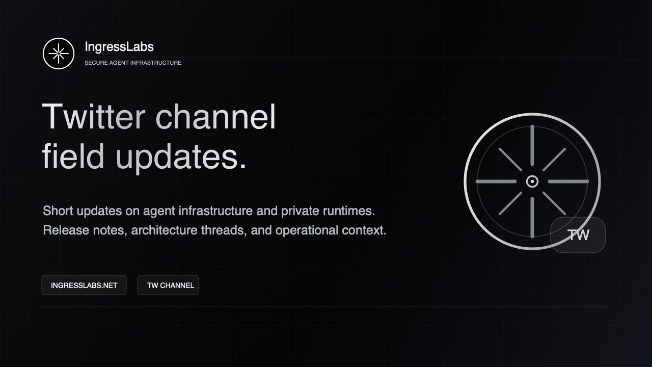
Use as the square profile or channel image on Twitter.

Use for pinned posts, channel announcements, and preview cards.

Use for channel introductions, announcement posts, and internal previews.

Use for profile posts, announcement cards, and social previews.
Keep the system neutral. Silver is an operational material, not a decorative accent competing with product information.
#050505
#0A0A0C
#101014
#B8BDC4
#EDF1F5
#FFFFFF
The mark needs enough empty field to keep the thin route geometry legible in small or high-contrast placements.
The public voice stays operational: short nouns, explicit systems, and copy that can survive a security review.
Use native platform fonts for names, headlines, product UI, and readable long-form text.
Use native monospace fonts for status, asset labels, versioning, records, and small technical metadata.
Treat the mark as infrastructure identity. It should clarify ownership and trust, not become decoration.
Metallic lockup on graphite, mono mark in dense interfaces, black lockup on light surfaces.
Blue variants, heavy rims, extra glows, rotation, stretching, textured backgrounds, or competing accent colors.
All SVG and PNG logo files live under /assets/brand/ and ship with the static site.